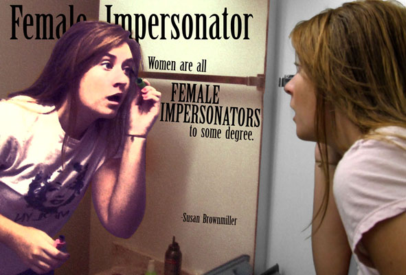
Just got a new banner posted today. It was actually an assignment for my digital photography class (we had to take a "meaningful bit of text" and create a picture for it).
Posted with the permission of the model, Kate.
What do you think of it from a creative standpoint?
Saturday, October 18, 2008
Subscribe to:
Post Comments (Atom)


3 comments:
I like it, both aesthetically and for its larger meaning. I like the technique done on the reflection, and the fact that it's the reflection that's somewhat flattened and fake looking, not her real person.
I like it - aesthetically, for the reasons Lindsay mentioned, and also because I think it does a great job of reflecting the blog's name and philosophy. Not that I didn't like the troll, too ;)
love it, good job, strong model, great blog.
Post a Comment